

2035 DESIGNER 名前


タイトル
メッセージ
名前
Title: “”
英文メッセージ
英文メッセージ
英名前

名前 ふりがな
アートディレクター経歴
Profile
Art director
英名前
英文プロフィール
Art director
英名前
英文プロフィール
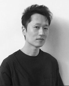
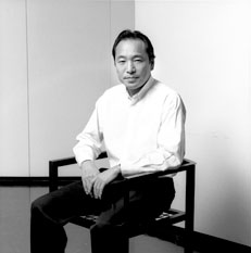
2026 DESIGNER 永井一史
タイトル
メッセージ
永井一史
Title: “”
英文メッセージ
英文メッセージ
Kazufumi Nagai
永井一史 ナガイ カズフミ
アートディレクター経歴
多摩美術大学美術学部卒業後、博報堂に入社。
2003年、デザインによるブランディングの会社HAKUHODO DESIGNを設立。
様々な企業・行政の経営改革支援や、事業、商品・サービスのブランディング、VIデザイン、プロジェクトデザインを手掛けている。
クリエイター・オブ・ザ・イヤー、ADC賞グランプリ、毎日デザイン賞など国内外受賞歴多数。著書に『博報堂デザインのブランディング』『これからのデザイン経営』など
Profile
Art director
Kazufumi Nagai
英文プロフィール
Art director
Kazufumi Nagai
英文プロフィール
2025 DESIGNER 北川一成


戦後80年。
平和の願いをこめて白の空間に墨の五文字、
「PEACE」の言葉を描きました。
両面表のポスターに成っています。
クレジットが鏡文字の白い「空」間は、くう、そら、
あく、あける、から、むなしい、すく、うつろ、
の言葉を表しています。
北川一成
Title: “Eighty years after the war.”
With hopefulness, I drew five characters
'PEACE' in black ink within a white space.
Both sides of the poster are its front.
The credits in mirrored letters appear on an "empty" space,
representing the words empty, sky, to be open,
to open, futility, vacancy, hollowness.
With hopefulness, I drew five characters
'PEACE' in black ink within a white space.
Both sides of the poster are its front.
The credits in mirrored letters appear on an "empty" space,
representing the words empty, sky, to be open,
to open, futility, vacancy, hollowness.
Issay Kitagawa
北川一成 きたがわ いっせい
GRAPH代表/アートディレクター1987年、筑波大学卒業。
2024年、「KAMIZU」で第26回亀倉雄策賞を受賞。
2004年、フランス国立図書館に、“近年の印刷とデザインの優れた本”として多数の作品が永久保存される。
2008年、グラフィックアーティストとして世界三大芸術祭“FRIEZE ART FAIR”に出品。
2011年、パリのポンピドゥー・センターで開催された現代日本のグラフィックデザイン展の作家15人の1人として選抜される。
AGI(国際グラフィック連盟)会員。ADC賞、TDC賞、JAGDA新人賞など受賞多数。NY ADC賞、D&AD賞等国内外の審査員を歴任。
テレビ出演にNHK「新ビジネス伝説・ルソンの壺」、テレビ東京「カンブリア宮殿」等他
Profile
Art director
Issay Kitagawa
Issay Kitagawa, Art Director and Representative Director of GRAPH Co., Ltd., graduated from the University of Tsukuba in 1987.
In 2024, he won the 26th Yusaku Kamekura Design Award for his art direction of the KAMIZU art project.
In 2004, a large number of his works were entered into the permanent collection of Biblioth$00E8que nationale de France as examples of modern book printing of superlative design.
In 2008, as a graphic artist Kitagawa showed his works at the Frieze Art Fair, one of the world’s three major art fairs.
In 2011, he was one of 15 artists selected to show at the Japanese Graphic Design Exhibition at the Pompidou Centre in Paris.
Issay Kitagawa is a member of Alliance Graphique Internationale (AGI). He is the recipient of numerous accolades, including the Tokyo ADC Award, Tokyo TDC Award, and JAGDA New Designer Award. He has appeared on a number of Japanese TV programs.
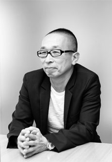
2024 DESIGNER 副田高行

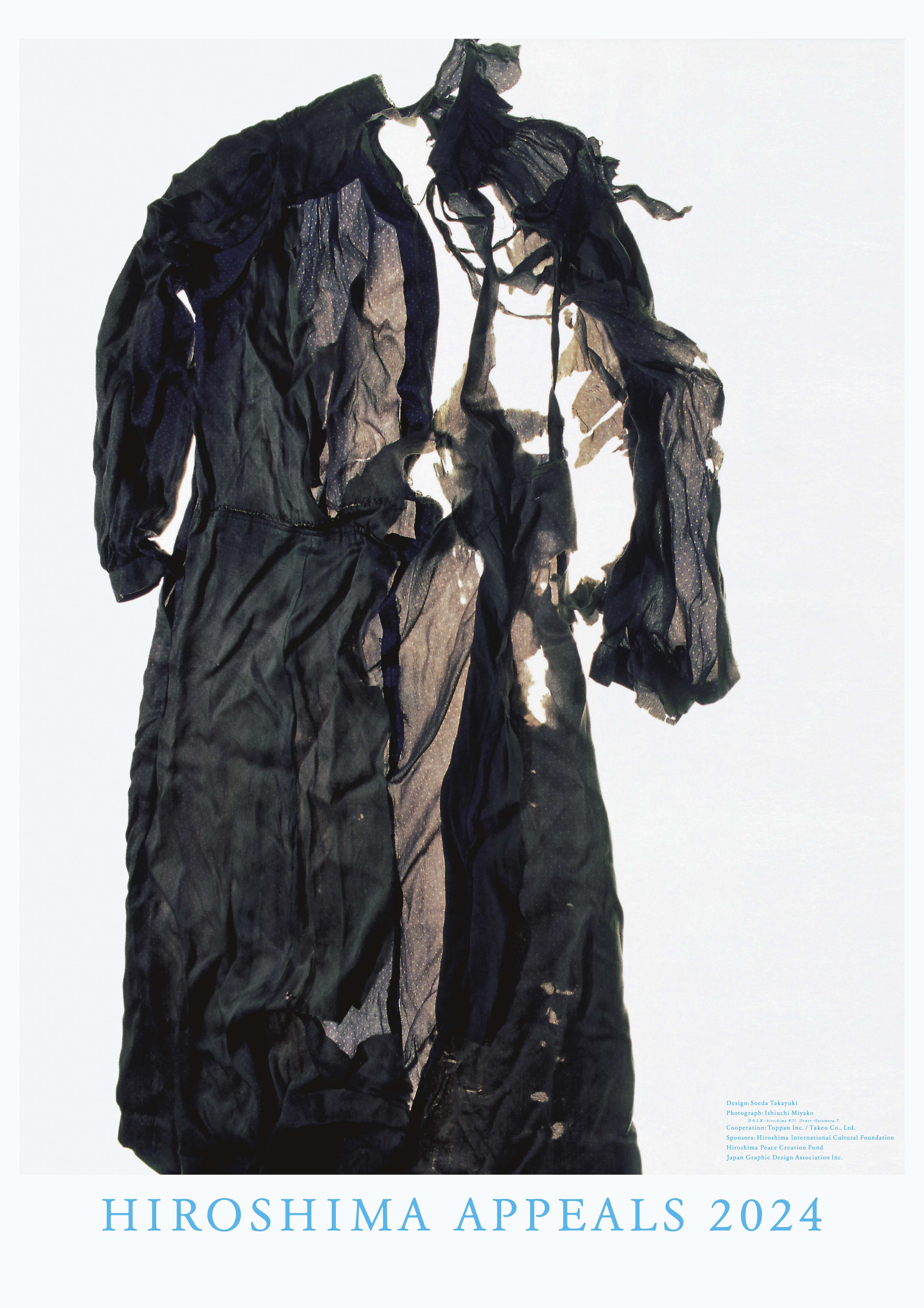
遺品が訴えるもの
戦後五年たって生まれた私には、とうぜん戦争の実感はとぼしい。戦後の空気はのこっていたが、毎年くりかえされる報道で、戦争のむごさや平和のたいせつさを感じていた。世界では、いまだに戦争がつづいている。人類は、いつまであやまちをくりかえすのだろうか。
「ヒロシマ・アピールズ」の指名があり、どうしたものかとしばらくは呆然としていた。ポスター一枚で、原爆のおそろしさ、平和、戦争反対をとなえることは、とてもたいへんな作業だとおもう。そんなこと自分にできるのか。私はふだん広告制作を生業としている。だから、デザイナーが頭のなかで描くイメージではなく、もっとリアリティのある表現はできないかと考えた。
当時の資料をしらべていくなかで、『ひろしま』という石内都さんの写真集にいきあたった。それは、出版社から依頼され、広島平和記念資料館・遺族同意のうえで撮影されたものだった。なかでも私の目をひいたのは、被爆者がその日身につけていた衣服だった。それはもちろんちぎれ、やぶれている。石内さんの解説によると、おおきなライトボックスの上において撮ったそうだ。その逆光の効果もあってか、不謹慎かもしれないが、悲惨さと同時にうつくしいとおもった。生なましさは消えて、おそろしいその瞬間をみごとに、象徴的に写しとっていると感じた。これなら、原爆のおそろしさを直截ではなく、シンボリックにつたえられるとおもった。この遺品は訴える。「あのできごとを、忘れるな」ということを。
石内さんの了解をえて、そのなかの一枚でポスターをつくった。現在でも遺族がたいせつに保管していた遺品が、毎年寄贈されるという。石内さんは、その後も毎年広島にいって撮影を行なっているそうだ。
副田高行
Title: “The Powerful Message of Left-behind Objects”
I was born five years after World War II, so I lack a real sense of what war entails. I experienced the post-war atmosphere, though, and I gained a sense of the cruelty of war and the importance of peace from the news headlines that repeated year after year. Today, wars continue to rage across the globe. How long will humankind continue to make the same mistakes?
When I received the Hiroshima Appeals commission, I sat stunned for a while and wondered how to proceed. I realized how difficult it would be to convey the horrors of the atomic bomb while espousing peace and a strong anti-war sentiment in just one poster. Was this task beyond me? I mainly create advertisements for a living. This led me to consider creating an image more grounded in reality rather than one sprung from a designer’s imagination.
While browsing through materials from that time, I came across “Hiroshima,” a photo collection by Miyako Ishiuchi. With the permission of the families and the Hiroshima Peace Memorial Museum, Ishiuchi was commissioned by a publisher to photograph articles left behind by atomic bomb victims. What struck me most were the clothes worn on that fateful day. As you’d expect, these were ripped and torn. Ishiuchi explained how she had placed the items on a large lightbox to shoot them. Perhaps I shouldn’t say this, but despite the tragic air, the objects also had a certain beauty, perhaps because of this backlight effect. The rawness is stripped away, with the photos portraying that awful moment in a powerfully symbolic way. Ishiuchi showed it was possible to represent the horror of the atomic bomb symbolically rather than directly. These artifacts contain a strong message: “Never forget what happened.”
With Ishiuchi’s consent, I used one of these photos to create the poster. Even now, each year brings new donations of treasured artifacts from the victims’ families. Ishiuchi also continues to visit Hiroshima annually to take photographs..
Soeda Takayuki
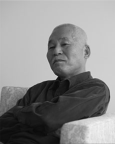
副田高行 そえだ たかゆき
アートディレクター1950年福岡県生まれ。東京都立工芸高校デザイン科卒。スタンダード通信社、サン・アド、仲畑広告制作所を経て1995年副田デザイン制作所設立。サントリー、新潮社、西武百貨店、東京ガス、TOTO、岩田屋、JR九州、シャープ、ANA、トヨタ、トンボ鉛筆、フジフイルム、AGF、朝日新聞社、NIKE、日本医師会、高橋酒造、岩波書店、NHK、JRA、野村ホールディングス、五島の椿、アンデルセン、earth music & ecology、宝島社などの広告を制作。ADC賞、ADC会員賞、朝日広告賞、毎日広告デザイン賞、日経広告賞、日本宣伝賞山名賞など受賞。著書に『副田高行の仕事と周辺』(六耀社)、ggg Books『副田高行』(トランスアート)、 『副田デザイン制作所仕事集』(美術出版社)、『副田高行がつくった新聞広告100選』(玄光社)がある。
Profile
Art director
Takayuki Soeda
Takayuki Soeda was born in Fukuoka Prefecture in 1950. He graduated from Tokyo Metropolitan Kogei High School with a concentration in Design. After working at Standard Advertising, SUN-AD Co., Ltd., and Nakahata Advertising Design Office, in 1995 he established Soeda Design Factory. During his long career, Soeda has produced ads for clients including Suntory, Shinchosha Publishing, The Seibu Department Stores, Tokyo Gas, TOTO, Iwataya, JR Kyushu, Sharp, ANA, Toyota, Tombow Pencil, FUJIFILM, Ajinomoto AGF, The Asahi Shimbun Co., Nike, Japan Medical Association, Takahashi Shuzo, Iwanami Shoten, NHK, Japan Racing Association, Nomura Holdings, Goto no Tsubaki, Andersen, earth music&ecology, and Takarajimasha. His awards received to date include the Tokyo ADC Award, Tokyo ADC Member's Award, Asahi Advertising Award, Mainichi Advertising Design Award, Nikkei Advertising Award, and the Japan Advertising Award Yamana Prize. His publications include “Soeda Takayuki no Shigoto to Shuhen ” (The Work and Activities of Takayuki Soeda - Rikuyosha), “Takayuki Soeda ” (gggBooks / TransArt), “Soeda Design Factory Thereafter” (Bijutsu Shuppan-sha), and “Jidai no kuki: Soeda Takayuki ga Tsukutta Shimbun Kokoku Hyaku-sen” (100 Newspaper Ads Created by Takayuki Soeda - Genkosha).
2023 DESIGNER 中村至男
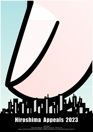

人差し指
先の戦争は、物心がついた時にはもう教科書の中の昔の出来事だった。ながく平和だと思いこみ育ってしまったが、歳を重ねるほど、この世界の危うさに自分の甘さを思い知る。震災、原発事故、疫病や戦争……想像を超えることが次々と起きる時代を生き、わかったつもりで世界を憂いても、核兵器使用?まさか、と心の底に一粒の傍観が残る自分に今一度問いたい。
このポスターを制作しながら、手元のスマホに目をやると、まさに広島からG7サミットが生中継され、各国首脳陣が原爆資料館を出て記念碑へと向かっている。核兵器は人間の所業に他ならない。人が起こすことは人が止められるのだ。
そんなことを想いながら1945年と地続きの”今”を表現した。この指は人間の弱さの象徴である。「人差し指」と名づけたこの一枚。2023年、広島からの訴えをつなぐ鎖のひとつになれたらと願っている。
中村至男
Title: “Index Finger.”
For as long as I can remember, the last war has seemed like an ancient event to our generation. I was raised under what I believed was a long period of peace. As I grow older, though, I realize how complacent I’ve been about the dangers of this world. Earthquakes, nuclear meltdowns, pandemics, war… In a world troubled by the knowledge that unimaginable things can keep happening, there is still a small part of me that feels like a bystander who thinks they will never use nuclear weapons again. I want to question my awareness of this world one more time. As I glanced at my smartphone while preparing this poster, I saw a live broadcast of the G7 Summit in Hiroshima, with the leaders of each nation leaving the Hiroshima Peace Memorial Museum to head toward the Memorial Monument for Hiroshima, City of Peace. Nuclear weapons are nothing more than the work of people. What people give rise to, people can stop. I had this thought in mind as I expressed the “now” that sits adjacent to 1945. This finger is a symbol of human fragility. I named this work “Index Finger.” I hope it can serve as a chain linking together the Hiroshima Appeals in 2023.
For as long as I can remember, the last war has seemed like an ancient event to our generation. I was raised under what I believed was a long period of peace. As I grow older, though, I realize how complacent I’ve been about the dangers of this world. Earthquakes, nuclear meltdowns, pandemics, war… In a world troubled by the knowledge that unimaginable things can keep happening, there is still a small part of me that feels like a bystander who thinks they will never use nuclear weapons again. I want to question my awareness of this world one more time. As I glanced at my smartphone while preparing this poster, I saw a live broadcast of the G7 Summit in Hiroshima, with the leaders of each nation leaving the Hiroshima Peace Memorial Museum to head toward the Memorial Monument for Hiroshima, City of Peace. Nuclear weapons are nothing more than the work of people. What people give rise to, people can stop. I had this thought in mind as I expressed the “now” that sits adjacent to 1945. This finger is a symbol of human fragility. I named this work “Index Finger.” I hope it can serve as a chain linking together the Hiroshima Appeals in 2023.
Norio Nakamura
中村至男 なかむら のりお
グラフィクデザイナー神奈川県川崎市生まれ。1990年日本大学芸術学部卒業、CBS・ソニー(現ソニー・ミュージックエンタテインメント)を経て1997年よりフリーランス。グラフィックデザインを中心に、広告、絵本、CI、デジタルコンテンツ、映像、イラストレーション、ブックデザインなどで活動。
著書に、 絵本『どっとこどうぶつえん』『はかせのふしぎなプール』『たなのうえひこうじょう』『ゆきだゆきだ』『サンタのコ』。『7:14』、『勝手に広告』(佐藤雅彦氏と共著)、『明和電機の広告デザイン』(土佐信道氏と共著)など。主な仕事に、21_21 DESIGN SIGHT「単位展」、アートユニット「明和電機」のグラフィックデザイン、銀座メゾンエルメスのウインドウディスプレイ、松山市立子規記念博物館、日本科学未来館、雑誌『広告批評』(1999年)、佐藤雅彦氏とのプロジェクトに、PlayStation「I.Q」やNHKみんなのうた「テトペッテンソン」など。ボローニャ・ラガッツィ賞優秀賞、NY ADC銀賞、毎日デザイン賞、亀倉雄策賞、東京ADC賞、東京TDC賞など受賞。
Profile
Norio Nakamura
Norio Nakamura was born in Kawasaki, Kanagawa. On graduating from the College of Art of Nihon University in 1990, he initially worked at CBS Sony (now Sony Music Entertainment) before going freelance in 1997. He creates primarily in the area of graphic design, but also in advertising, picture books, CI, digital content, video, illustration and book design. As both writer and illustrator, he has published picture books including Dottoko Zoo, A Scientist and His Amazing Pool, Flying round the House, The Snowy Day!, Santa Boy and 7:14. He has also published in collaboration with Masahiko Sato and Nobumichi Tosa. Mr. Nakamura’s main works include: “Measuring: This much, That much, How much?” exhibition at 21_21 DESIGN SIGHT; graphic design for the art unit Maywa Denki; window displays for Ginza Maison Hermes; commissions for Matsuyama City Shiki Memorial Museum and National Museum of Emerging Science and Innovation; Kokoku Hihyo?advertising critique magazine (1999); “I.Q.” PlayStation video game, created with Masahiko Sato; and the animated film Tetopetenson for NHK’s “Minna no Uta” (Songs for Everyone) program. He is the recipient of a BolognaRagazzi “Special Mention” Award, New York ADC Silver Award, Mainichi Design Award, Yusaku Kamekura Design Award, Tokyo ADC Award, Tokyo TDC Award, etc.
2022 DESIGNER 佐藤可士和
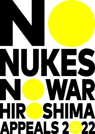

NO NUKES NO WAR
2022年2月24日、ロシアによるウクライナ侵攻。そして核兵器の使用の威嚇。世界の緊張が高まる中、スウェーデンのストックホルム国際平和研究所は、核兵器が使われるリスクが冷戦以降で最も高まり、減少傾向が続いてきた世界の核弾頭の総数が今後10年間で増加に転じる可能性があると発表した。世界の安全保障環境は緊張を増し、厳しい現実が突きつけられている。日本は唯一の被爆国として、核兵器の恐ろしさを世界に伝える特別な役割を担っている。核兵器のない世界に向けて、今こそストレートに声を上げる必要があると強く感じた。ポスターは敢えてタイポグラフィーのみで構成し、力強い文字でデザインした「NO NUKES NO WAR HIROSHIMA APPEALS 2022」のメッセージそのものをメインビジュアルとした。Oと0の文字を黄色い円(和)にし、この難しい時代にあって、平和の実現を心から願う未来に向けての希望の光を表現した。一人一人が心にある希望の光を灯してつなげ、一つでも多くの希望の光が広がり、ヒロシマ・アピールズの活動が少しでも世界平和に寄与するよう願っている。
佐藤可士和
Title: “NO NUKES NO WAR”
February 24, 2022: Russia invades Ukraine, followed by threats to use nuclear weapons. With tensions rising around the world, the Stockholm International Peace Research Institute (SIPRI) in Sweden, announced that the risk of nuclear weapons being used seems higher now than at any time since the height of the Cold War, and although marginal decreases in the overall number of nuclear warheads have been realized until now, nuclear arsenals are expected to grow over the coming decade. We are currently facing the harsh reality of increasing tensions in the global security environment. As the only country to have suffered atomic bombings Japan has a special role to play in sending out a message to the world about the horrors of nuclear weapons. I have a strong sense that now is the time?to?send out a clear and stark message towards a world free of nuclear weapons.?The poster boldly features just typography,?with the message “NO NUKES NO WAR HIROSHIMA APPEALS 2022” forming the main visuals in a design featuring dynamic letters and numerals. The letter “O” and the number “0” on this poster have been stylized as yellow circles. The circular shape is described as “wa” in Japanese, which is also the same pronunciation as the Japanese word meaning peace, or harmony. As both of these words are pronounced the same way, the “wa” in this design holds a dual significance in its message?to the world. It symbolizes a ray of hope for the future that we can attain peace and overcome these dark and difficult times. It is my dearest wish that each and every one of us will light up the hope in our hearts and come together so that we can spread as many rays of hope as possible, and that the activities of Hiroshima Appeals will make?a contribution, however?small,?to world peace.
February 24, 2022: Russia invades Ukraine, followed by threats to use nuclear weapons. With tensions rising around the world, the Stockholm International Peace Research Institute (SIPRI) in Sweden, announced that the risk of nuclear weapons being used seems higher now than at any time since the height of the Cold War, and although marginal decreases in the overall number of nuclear warheads have been realized until now, nuclear arsenals are expected to grow over the coming decade. We are currently facing the harsh reality of increasing tensions in the global security environment. As the only country to have suffered atomic bombings Japan has a special role to play in sending out a message to the world about the horrors of nuclear weapons. I have a strong sense that now is the time?to?send out a clear and stark message towards a world free of nuclear weapons.?The poster boldly features just typography,?with the message “NO NUKES NO WAR HIROSHIMA APPEALS 2022” forming the main visuals in a design featuring dynamic letters and numerals. The letter “O” and the number “0” on this poster have been stylized as yellow circles. The circular shape is described as “wa” in Japanese, which is also the same pronunciation as the Japanese word meaning peace, or harmony. As both of these words are pronounced the same way, the “wa” in this design holds a dual significance in its message?to the world. It symbolizes a ray of hope for the future that we can attain peace and overcome these dark and difficult times. It is my dearest wish that each and every one of us will light up the hope in our hearts and come together so that we can spread as many rays of hope as possible, and that the activities of Hiroshima Appeals will make?a contribution, however?small,?to world peace.
Kashiwa Sato
佐藤可士和 さとう かしわ
クリエイティブディレクター/ SAMURAI代表1965年東京生まれ。
ブランド戦略のトータルプロデューサーとして、コンセプトの構築からビジュアル開発、空間デザイン、コミュニケーション戦略のディレクションまで、強力なクリエイティビティによる一気通貫した仕事が多方面より高い評価を得ている日本を代表するクリエイター。文化庁による文化交流使としても活動し、日本の優れた商品、文化、技術、コンテンツなどを広く世界に発信していくことにも注力している。2021年春には、シンボルマークデザインを手掛けた国立新美術館(東京・六本木)にて「佐藤可士和展」を開催し好評を博す。
著書に「佐藤可士和の超整理術」(日本経済新聞出版)ほか。東京ADCグランプリ、日本空間デザイン賞金賞、ICONIC AWARDS 2021 BEST OF BESTほか多数受賞。京都大学経営管理大学院特命教授(2021-)。
Profile
KASHIWA SATO
Creative Director / CEO of SAMURAI
Kashiwa is one of Japan’s leading creators, earning much praise for his thorough and powerfully creative works. As a comprehensive “total producer” for brand strategies, he deals with all aspects of a project, from building concepts and developing visuals and spatial design to directing communication strategies. Furthermore, as Japan’s cultural envoy for the Agency for Cultural Affairs, Kashiwa is actively involved in promoting Japan’s unique products, culture, technology, and content to the rest of the world. Kashiwa also designed the logomark for The National Art Center, Tokyo (Roppongi, Tokyo), and in spring of 2021, the Center hosted the highly successful Kashiwa Sato Exhibition. Kashiwa is author of Kashiwa Sato’s Ultimate Method for Reaching the Essentials (published by Nihon Keizai Shimbun), among other works. He is also winner of multiple awards, including the Tokyo ADC Grand Prix, the KUKAN DESIGN AWARD GOLD PRIZE and ICONIC AWARDS 2021 BEST OF BEST. Since 2021, Kashiwa has served as an adjunct professor at Kyoto University, Graduate School of Management.
2021 DESIGNER 大貫卓也
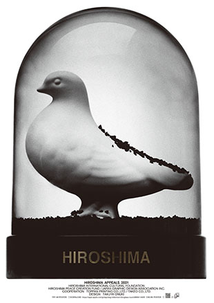
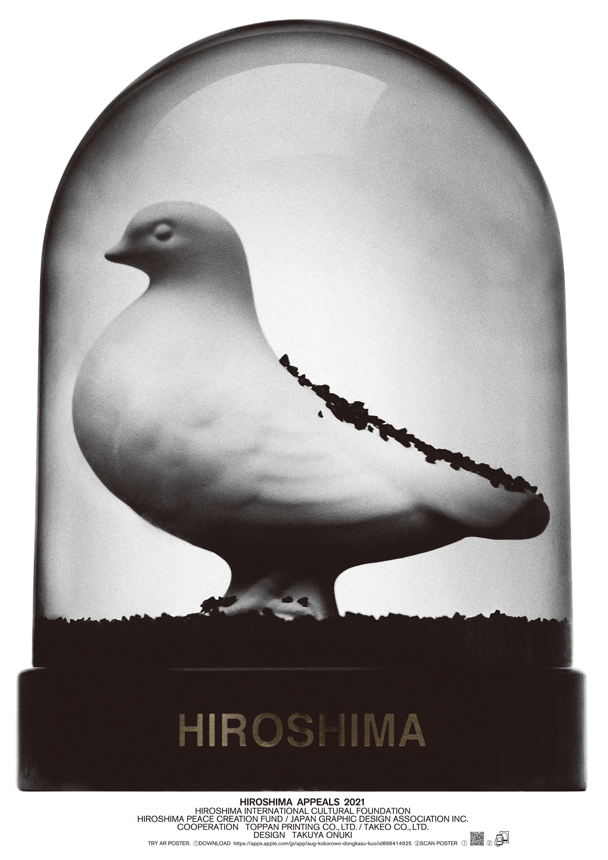

HIROSHIMA
長年、広告という多くの人へ伝えることを生業にしてきました。
今日よりも、少しでも明るく楽しい未来を提示することが広告だと思っています。
しかし今回、わたしは原子爆弾の脅威を今の若者へ歴史としてではなく、ライブ感をもって伝えることが、原爆という事実を風化させずに、心に刻むことになるのではないか、そのほうが希望のある未来に協力することになるのではないかと考えました。
原爆を体験した語り部が減少していく現在、原子爆弾という存在をきちんと後世へ伝えていくヒロシマ・アピールズという活動に関わることは表現者として身の引き締まる思いです。
今回のポスターはAR(拡張現実)を使用したポスターです。
スノードームには平和の象徴である白い鳩が入っています。
そして、通常ならスノードームには白い粉が封入されているものですが、この作品には黒い粉が封入されています。
携帯をこのポスターにかざすことで、このポスターは動き出します。※ それも、時間を巻き戻すように。
やがて黒い粉がドームの中に充満し、平和が踏みにじられた様子、戦争、原子爆弾、黒い雨などが想起され、戦争をリアルに感じることとなり、胸をしめつけられるかもしれません。
その黒い粉はやがてゆっくりと地上に落ちてゆき、そこに微動だにしない白い鳩があらわれます。
スノードームとは本来、ゆっくりと雪が落ちてゆく様子を見ることで各々に自分なりのストーリーを想像させる、そんな装置でもあると思っています。この作品は、原子爆弾にリアリティーを持たなくなってしまった世代の若者へ、一瞬でも、考え、想像させる時間を持ってもらうための表現として考えています。
さらに言えば、戦争や原爆についてガラス越しに俯瞰して眺めている人に対して気が付いてほしいこと。それは、ガラスに閉じ込められた白い鳩はまだ自由に飛び立ってはいないということ。
白い鳩が、世界中で自由に飛び立つ日が来ることを願っています。
大貫卓也 アートディレクター
※スマートフォンでAR専用アプリ「aug!」をダウンロードし、アプリを開いてポスターにスマートフォンをかざすことで、ARポスターをご覧になれます。
大貫卓也
Title: “HIROSHIMA”
For many years, I have made a living by conveying ideas to many people or “advertising.” I believe advertising is presenting a future that is brighter and more fun than today, even if only by a little. However, this time, I felt that the way to help create a more hopeful future is to convey to young people that the threat of nuclear weapons is not part of history, but a very real part of their lives, and, by doing so, ensure that the reality of nuclear weapons doesn’t fade from our minds, but stays etched in our hearts. As someone who works in visual expression, it is very sobering to be involved in the activities of the Hiroshima Appeals, which seeks to clearly inform the next generation of the existence of nuclear weapons amid the continued decline in the number of “kataribe” or people who experienced the atomic bombing.
This year’s poster uses augmented reality (AR). Inside the snow globe there is a white dove, the symbol of peace. Normally there would be white powder in the snow globe, but for this piece, we have black powder. If you place your phone over the photo, it starts to move,* as if time is working in reverse. Eventually, the dome is filled with the black powder, which may bring to mind the idea of peace being crushed by war, nuclear weapons, and “black rain,” etc., and create a real and gut-wrenching sense of war. Ultimately, the black powder falls slowly to the ground, at which point a completely motionless white dove appears.
Conventionally, I believe a snow globe is also a device for making each person viewing it imagine their own story as they watch the snow falling slowly down. My aim, in expressing this work in this way, is to encourage the younger generation, who no longer view nuclear weapons with a sense of reality, to take the time or even just a moment to think and imagine. If I could elaborate further, there is something I want people to notice as they look through the glass and take a bird’s-eye view of war and the atomic bombing ? the white dove, trapped in the glass dome, has yet to fly free. I pray for the day when the white dove will be able to fly free in our world.
*You can see the AR version of the poster by downloading and opening the smartphone AR app “aug!” and placing your phone over the poster.
Takuya Onuki
大貫卓也 おおぬき たくや
アートディレクター1958年東京生まれ。1980年多摩美術大学グラフィックデザイン科卒業。同年、博報堂入社。1993年大貫デザイン設立。
としまえん、日清食品カップヌードル、ラフォーレ原宿、新潮文庫Yonda?、ペプシコーラPepsiman、資生堂TSUBAKI、SoftBankなど、多くのブランドコミュニケーションを行う。
東京ADC賞・会員賞・会員最高賞・グランプリ(1981・1986・1987・1989~2002・2007・2018)、カンヌ国際広告映画祭グランプリ(1992)・金賞・銀賞(1993・1994・1995)、ニューヨークADC賞金賞(1992)・銀賞(1992・1993)、毎日デザイン賞、毎日広告デザイン賞最高賞、ほか受賞多数。
Profile
Takuya Onuki
Art Director
Born in Tokyo in 1958. After graduating from the Department of Graphic Design, Tama Art University in 1980, joined Hakuhodo Inc. the same year. Founded Onuki Design in 1993. Has worked on brand communication campaigns for a wide range of clients and brands, including Toshimaen, Nissin Food Products’ Cup Noodle, Laforet Harajuku, Shincho Bunko’s Yonda?, Pepsi Cola’s Pepsiman, Shiseido’s Tsubaki, and SoftBank. Winner of numerous awards, including Tokyo ADC Award, Members’ Award and Members’ Grand Prize (1981, 1986, 1987, 1989?2002, 2007, 2018); Cannes Lions International Advertising Festival Grand Prix (1992) and Gold and Silver Lions (1993, 1994, 1995); NY ADC Gold Prize (1992) and Silver Prize (1992, 1993); Mainichi Design Award; and Mainichi Advertisement Design Grand Prize.
ヒロシマ・アピールズ2021ポスター購入はこちらから ▶
2020 DESIGNER 渡〓良重
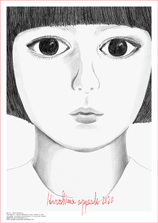
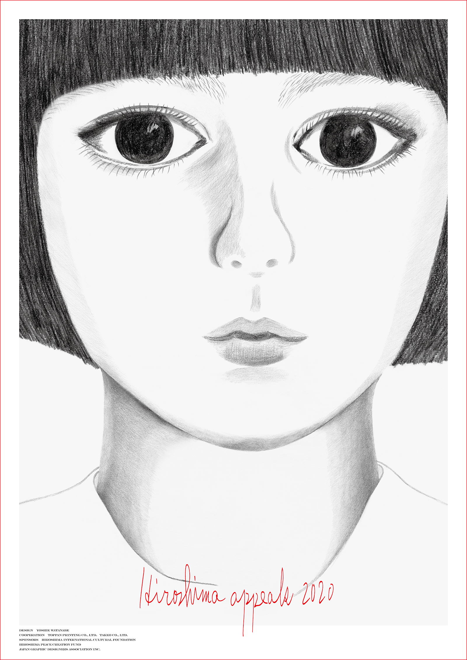
いのち
平和な日常がおくれるのは特別なことです。
わたしがこのコメントを書いている今は世界中がウイルスと戦っていて、この禍いは国家間の情報戦争や経済戦争に発展しています。
わたしには世界はますます複雑で多くの欲望が渦巻いているように見えます。
とても悲しいことですが、今はどう望んでもすぐには世界中に平和が訪れるとは思えません。
それならばまずは、日本は日本の力で、わたしたちひとりひとりの力でこの国とわたしたちの命を守ること。
ここから始めるしかないように思います。
このポスターの依頼を受け、わたしは命を描きたいと思いました。
この少女は幼かったころのわたしの母であり、わたしであり、日本中の少女でありそして世界中の少女です。
この命が輝けますように。
渡〓良重
Title: “Life”
Design concept: Being able to enjoy peace in our everyday lives is something special. As I write these words, the world is fighting against a virus, a crisis that has also prompted countries to engage in information and economic wars.
To me, it appears as if the world is becoming increasingly complicated and more and more greed is rising to the surface. This fills me with great sadness. No matter how much I wish it were so, I do not think the world will be at peace anytime soon.
If that is the case, as a starting point, Japan must do all that it can, and we must each do all that we can, to protect this country and our lives. That is all we can do.
When I was asked to create this poster, my aim was to portray “life.” This little girl represents my mother when she was a little girl, me when I was a little girl, all the little girls in Japan, and all the little girls around the world. I hope that this “life” will shine bright.
Yoshie Watanabe
渡〓良重 わたなべ よしえ
1961年山口県生まれ。山口大学卒業。DRAFTを経て植原亮輔とともに2012年にKIGIを設立。グラフィックデザインのほか、D-BROSの商品企画、ほぼ日とファッションブランドCACUMA、滋賀県の伝統工芸職人とプロダクトブランドKIKOFを立ち上げるなど、プロダクトやファッションデザインも手掛ける。プライベートでも制作を行い、展覧会の開催や作品の発表をしている。2015年東京・白金にてショップ&ギャラリー「OUR FAVOURITE SHOP」をオープン。絵本「BROOCH」「UN DEUX」「ジャーニー」や作品集「キギ/KIGI」「KIGI_M」をリトルモアより刊行。東京ADCグランプリ、D&AD金賞、NY ADC金賞、第19回亀倉雄策賞など受賞。
Profile
Yoshie Watanabe
Born in Yamaguchi Prefecture in 1961. Graduated from Yamaguchi University. In 2012 she established KIGI together with Ryosuke Uehara, after working at DRAFT. Besides her graphic design work, Watanabe is also involved in product and fashion design, directing the “D-BROS” product brand, and launching the “CACUMA” clothing brand together with Hobo Nikkan Itoi Shinbun (Hobonichi), as well as the “KIKOF” product brand in partnership with artisans of traditional crafts based in Shiga Prefecture. She is involved in design activities outside of work as well, holding exhibitions and creating artworks. In 2015 Watanabe opened OUR FAVOURITE SHOP, a shop & gallery in Tokyo’s Shirokane area. Watanabe’s publications to date include illustrative works such as “BROOCH,” “UN DEUX,” and “JOURNEY,” as well as two collections of KIGI’s works: “KIGI” and “KIGI_M,” published by Little More. Awards Watanabe has received to date include the Tokyo ADC Grand Prize, a D&AD Yellow Pencil (Gold Award), a New York ADC Gold Prize, and the 19th Yusaku Kamekura Award.
ヒロシマ・アピールズ2020ポスター購入はこちらから ▶
2019 DESIGNER 澁谷克彦
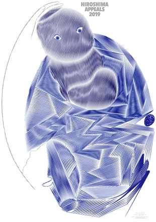
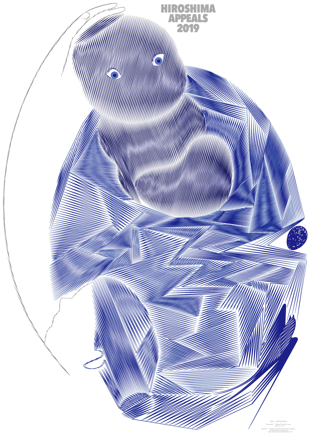
[希望]
被爆直後の広島を描いた本に、“羽の焼けたつばめは空を飛べなくなってピョンピョンと地面を歩いて”いたと記されていた。もちろん爆心地を飛んでいたものたちは跡形もなくなってしまっただろうが、どの鳥より素早いつばめが羽を焼かれてしまうことこそ、原爆の一瞬の威力に他ならない。巣の中の雛たちは、飛べなくなった親を待ち続けたのか。
広島に原爆が落ちて長い時間が経ち、市民の多くは被爆した人々の子供や孫の世代になった。しかしそのとき壊されたものは彼らの心身に入り込み、終わりはなく、そこにこの原子爆弾というものの異様さを感じる。
子供は未来への希望。新しい世代をとりまく世界が平和であり続けるため、少しでも多くの人が世界の大人たちに広島の物語を語り伝えて欲しいと、そんな思いをポスターに込めた。
澁谷克彦
Title: “Hope”
In a book about the immediate aftermath of the bombing of Hiroshima, it was written that “swallows whose feathers were scorched and were unable to fly were walking along the ground by hopping about.” Naturally, there was no trace left of the birds that had been flying through the center of the explosion, but the very fact that swallows, the most agile of all birds, had their feathers scorched illustrates the instantaneous power of the atomic bomb like nothing else. Did chicks wait endlessly in their nests for their parents, which were no longer able to fly? A long time has passed since the atomic bomb fell on Hiroshima, and many of the city’s citizens are the children and grandchildren of the victims of the bombing. Nevertheless, the things that were destroyed at that time are carried within them and do not end. Therein lies the extraordinary nature of this atomic bomb, I feel.
Children are the hope of the future. In order for the world that new generations live in to continue to be peaceful, I want as many people as possible to convey the story of Hiroshima to the adults of the world. It is this wish that I embodied in the poster.
Katsuhiko Shibuya
澁谷克彦 しぶや かつひこ
東京生まれ。1981年東京藝術大学デザイン科卒業、同年株式会社資生堂宣伝部入社、多くの広告やブランドのクリエイティブディレクション、アートディレクション、CI、グラフィックデザインを手がける。2012年同社の宣伝・デザイン部長およびエグゼクティブクリエイティブディレクター、2017年よりフリーランスとして活動。
主な仕事:
・グローバルブランドのクリエイティブディレクション
「クレ・ド・ポー ボーテ」 「SHISEIDO」 「INOUI ID」 といったグローバル展開ブランドの、グラフィック、CI、広告+パッケージ+スペースのデザインをトータルにディレクションする
・国内ブランドのクリエイティブディレクション及びアートディレクション
「PERKY JEAN」 「男のギア」 「RECIENTE」 「エリクシール」 「PN」 「ZEN」 など化粧品広告をはじめ、「AYURA」 「ISSEY MIYAKE」 「TSUMORI CHISATO」などのアートディレクション&CIデザイン。
・「花椿」誌アートディレクション
主な受賞:
2012年亀倉雄策賞、2012東京ADC会員賞、2005年、2003東京ADC賞、2006年、2002年、2001ニューヨークADC特別賞、2013年、2010年、2008年JAGDA賞、1990年JAGDA新人賞、1992年東京TDC金賞など受賞。
デザイン団体での活動:JAGDA国際委員長、TDC理事、東京ADC会員、AGI会員
教育:
女子美術大学教授(2017~)、金沢美術工芸大学客員教授、大阪芸術大学短期部客員教授
Profile
Katsuhiko Shibuya
Born in Tokyo. Graduated from the Department of Design, Tokyo University of the Arts in 1981, joined the Advertising Department at Shiseido Company, Ltd. the same year, and worked in the fields of creative direction, art direction, CI and graphic design for a large number of advertisements and brands. Was appointed as head of the Advertising and Design Departments and Executive Creative Director at the company in 2012, and has been working in a freelance capacity since 2017.
Major projects:
- Creative direction of global brands: Comprehensive direction of the design of graphics, CI, and advertising/packaging/space for international brands such as Cle de Peau Beaute, Shiseido and Inoui ID.
- Creative direction and artistic direction of domestic brands: Artistic direction and CI design for Ayura, Issey Miyake, Tsumori Chisato and others, beginning with cosmetics commercials for Perky Jean, Otoko no Gear, Reciente, Elixir, PN, Zen and other brands.
- Art direction at “Hanatsubaki” magazine.
Major awards:
Recipient of the 2012 Yusaku Kamekura Design Award, 2012 Tokyo ADC Member Award, 2005 and 2003 Tokyo ADC Awards, 2006, 2002 and 2001 New York ADC Special Awards, 2013, 2010 and 2008 JAGDA Awards, 1990 JAGDA New Designer Award, 1992 Tokyo TDC Gold Medal and other awards.
Activities in design organizations:
JAGDA’s International Committee chair, TDC director, Tokyo ADC member, and AGI member
Education activities:
Professor at Joshibi University of Art and Design (since 2017), Affiliate Professor at Kanazawa College of Art, and Affiliate Professor at Osaka University of Arts Junior College
ヒロシマ・アピールズ2019ポスター購入はこちらから ▶
2018 DESIGNER 服部一成
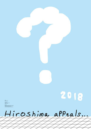

「疑問符、2018」
Hiroshima appeals(広島は訴える)。自分が作ろうとしているポスターは何を訴えるのか、それは自明のことのようでもあり、解けない問題のようにも思えた。残された資料に触れるにつれ、知っていたはずの広島と原爆にうちのめされた。自分には広島を代弁する資格も力量もない。まずそのことを自覚することから始めた。 広島の空に原爆のきのこ雲が浮かんだ日から73年が経つ。なにも解決せず、多くの問いかけがぽっかりと宙に浮かんだままだ。ポスターに描いたのは、そんな2018年の世界の風景だ。 こんな呑気なはてな雲のポスターで何を訴えるのかと笑われるのを恐れて、自分はこの言い訳めいた文章を書いているのかもしれない。だが、ポスターの成果とは別に、とにかく広島について考えた今回の個人的な体験にも、小さな意義はあったという気持ちもある。広島が問うていることをそれぞれが考えつづける、その先に、今はまだ見えない何かがあるのだと思いたい。
服部一成
服部一成 はっとり かずなり
グラフィックデザイナー1964年東京生まれ。
1988年東京芸術大学美術学部デザイン科卒業、ライトパブリシティ入社。
2001年よりフリーランスのグラフィックデザイナー、アートディレクターとして活動。
主な仕事に、「キユーピーハーフ」などの広告、雑誌『流行通信』『here and there』『真夜中』、エルメスのイベント「petit hのオブジェたち」の会場デザイン、「三菱一号館美術館」などのロゴタイプ、POLAの新VIシステム、「CAFE@HOME UCC」のパッケージ、東京国立近代美術館「声ノマ 全身詩人、吉増剛造展」などの展覧会のポスター・告知物・図録、ロックバンド「くるり」のアートワーク、『プチ・ロワイヤル仏和辞典』、中平卓馬写真集『来たるべき言葉のために』、ホンマタカシ『たのしい写真』、原田治『ぼくの美術ノート』などのブックデザインがある。
毎日デザイン賞、亀倉雄策賞、東京ADC賞、原弘賞、東京TDCグランプリなどを受賞。
Profile
KAZUNARI HATTORI Graphic Designer
Born in 1964 in Tokyo. In 1988, graduated from the Department of Design, Tokyo National University of Fine Arts and Music (present Tokyo University of the Arts) and joined Light Publicity Co., Ltd. Mr. Hattori has been a freelance graphic designer and art director since 2001. His designs have been featured in a number of mediums and places, notably: “Kewpie Half” advertising; magazines Ryuko Tsushin, here and there, and Mayonaka; “petit h” Hermes event venue; Mitsubishi Ichigokan Museum logotype; POLA’s new VI system; CAFE@HOME UCC packaging; posters, ads, and catalogs for exhibitions including “The Voice Between: The Art and Poetry of Yoshimasu Gozo” at the National Museum of Modern Art, Tokyo; artwork for rock band Quruli; and book designs for Petit Royal Dictionnaire Japonais-Francais; For a Language to Come, a collection of photographs by Takuma Nakahira; Tanoshii Shashin (Enjoyable Photography) by Takashi Homma; and Boku no Bijutsu Noto (My Notes on Art) by Osamu Harada. He is the recipient of numerous awards, including Mainichi Design Awards, Yusaku Kamekura Design Award, Tokyo ADC Award, Memorial Prize of Hiromu Hara, and Tokyo TDC Grand Prix.
ヒロシマ・アピールズ2018ポスター購入はこちらから ▶
2017 DESIGNER 原 研哉
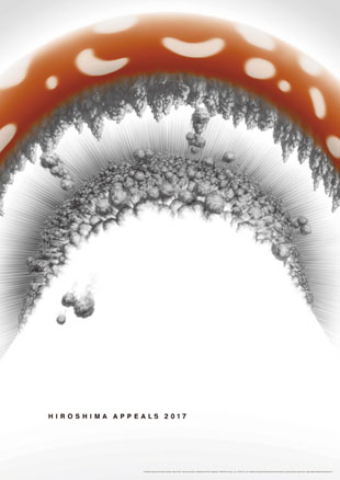
「HIROSHIMA APPEALS 2017 キノコ図」
キノコ雲を下から見上げる図である。日本の、広島の人々の、まさに頭上で、人類史上最悪の奸智の結晶が炸裂した。その瞬間に眼を凝らそうと思った。ポスターには移ろう現実や心情を永遠に静止させる力がある。ポスター表現としての「HIROSHIMA APPEALS」は、静止画であるところに意義がある。まさに祈りを制作しているのだ。原爆で亡くなった方々のことを考えると、あらゆる表現は無力だが、頭上で核兵器が炸裂した街があるという事実に、意識の照準を合わせてみることが、祈りに通じるのではないかと思った。
「抑止力」と称されつつ、地球を幾重にも破壊できる量の核兵器が準備されている現実を考えると、絶望的な気持ちになる。人類は自分たちが考えているほどには賢くはない。「わたし」や「国」や「信条」といったものを優先するために、自分たちが生きる母胎すらも破壊しかねない人類は悲しいほど愚かだ。生の連繋を本能的に尊重しつつ生きているように見える他の生物たちよりも、はるかに先の短い存在なのかもしれない。
リアルなイラストは、30年来の付き合いになる水谷嘉孝との共同制作である。僕が原画を描き、それをそのまま、水谷の技術で精緻に仕上げていく。自分の頭の中にあるイメージを精密に可視化していくためにお願いしているコラボレーションである。原画はキノコの傘を丸ごと描いたが、最後にトリミングをした。もう一歩、爆発の中に踏み込んでみた。
原 研哉
Title: “Hiroshima Appeales 2017 Mushroom Illustration”
This is an illustration drawn from the perspective of looking up from below a mushroom cloud. The embodiment of the worst evil in human history explodes just overhead of the people of Hiroshima and of Japan. I wanted to look straight into that moment. Posters have the ability to freeze fading reality and emotion for eternity. Hiroshima Appeals expressed as posters are meaningful because they are still images. They are like creating prayers. When I thought about the people who died in the atomic bombing, various depictions didn’t work, but when I focused on the awareness that there are towns where nuclear weapons exploded overhead, I felt that could lead to prayer.
I am filled with despair with the reality that nuclear weapons are being stockpiled in quantities that can destroy the Earth several times over while being called “deterrence.” The human race is not as wise as we think. It is depressingly stupid that mankind can destroy the foundations of civilization to prioritize “self,” “country,” and “creed.” Our existence may be far more short-lived than other creatures that live in respect of nature’s bonds.
I have been doing realistic illustrations in collaboration with Yoshitaka Mizutani, whom I have known for 30 years. I create the original drawing and then he finishes it with his own detailed technique. It is a collaboration where he creates a detailed visualization of the images that are in my head. The original drawing depicted the entire mushroom cap, but we cropped it for the final version. I went one step further and stepped into the explosion.
Kenya Hara
Photo : Yoshiaki Tsutsui
原 研哉 はら けんや
1958年岡山県生まれ。「もの」のデザインと同様に「こと」のデザインを重視して活動中。
2000年に「RE-DESIGN─日常の21世紀」という展覧会を制作し、何気ない日常の文脈の中にこそ驚くべきデザインの資源があることを提示した。
2002年に無印良品のアドバイザリーボードのメンバーとなり、以後アートディレクションを展開。
2004年には「HAPTIC─五感の覚醒」と題する展覧会を制作、人間の感覚の中に大きなデザインの資源が眠っていることを示した。長野オリンピックの開・閉会式プログラムや、2005年愛知万博の公式ポスターを制作するなど日本の文化に深く根ざした仕事も多い。2007年、2009年にはパリ・ミラノ・東京で「TOKYO FIBER ─ SENSEWARE展」を、2008-2009年には「JAPAN CAR展」をパリとロンドンの科学博物館で開催するなど、 産業の潜在力を展覧会を通して可視化し、広く世界に広げていく仕事に注力している。2010年に「HOUSE VISION」の活動を開始、2013年・2016年に東京展を開催した。2012年から「犬のための建築」展、2014年に「TAKEO PAPER SHOW 2014 SUBTLE」を開催するなど、常にものの捉え方や価値観を更新するビジョンを提起するプロジェクトを多数手がける。
2011-2012年には北京を皮切りに「DESIGNING DESIN 原研哉 中国展」を巡回し、活動の幅をアジアへと拡大。2015年に外務省「JAPAN HOUSE」総合プロデューサーに就任。著書「デザインのデザイン」や「白」はアジア各国語版をはじめ多言語に翻訳されている。日本デザインセンター代表取締役社長。武蔵野美術大学教授。 日本グラフィックデザイナー協会副会長。
Profile
Kenya Hara (1958?)
Born in 1958, he is the president of Nippon Design Center, Inc., and professor at Musashino Art University. He regards design as universal wisdom accumulated in society, and is engaged in the drafting and execution of various design plans focusing on communication. He is active in diverse fields, including as art director for MUJI, in visual identity work for Daikanyama Tsutaya Books and GINZA SIX, and in the exhibition “HOUSE VISION.” He has acted as the general producer of JAPAN HOUSE, a communications hub of the Ministry of Foreign Affairs, from 2015. His books, Designing Design (Iwanami Shoten, winner of the Suntory Prize for Social Sciences and Humanities) and White (Chuokoron-Shinsha), have been translated into a number of languages.
ヒロシマ・アピールズ2017ポスター購入はこちらから ▶
2016 DESIGNER 上條 喬久
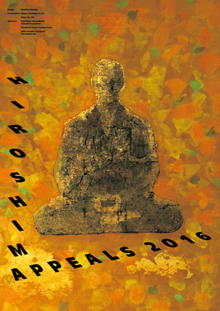
「祈りの風景」
2016年5月、現職の米大統領として初めて、オバマ大統領の広島訪問が実現し、スピーチで「核兵器廃絶」の願いが明快に述べられた。それは戦後71年で初めての快挙と言える出来事であった。
その同じ時期、私はHIROSHIMA APPEALSの平和ポスターの制作を始め、原爆の悲惨さをいかにシンボリックに表現するかに腐心していた。
しかし、オバマ大統領訪問の陰にあった広島の人々の努力と平和への想いを知って、それまでの考え方を大きく転換することになった。告発し、謝罪を喚起するという対立軸ではなく、赦し、和解し、共に祈るという、深く静かな強い平和への希望を軸とする表現である。
私は常々、グラフィック・デザインの作品は街や生活の中で、風景になって欲しいと願っている。つまり、自分の内なる想いが受け入れられ、風景となって存在することが理想と考えている。
HIROSHIMAAPPEALS2016も平和を強く希求し祈る気持ちをカタチにした。祈りがカタチになった。もしも、そこに共感が生まれるならば、きっと大きなメッセージとなり、祈りの風景になることを願っている。
Title: “Landscape of Prayer“
The first visit to Hiroshima by a sitting United States President was realized by President Barack Obama in May 2016. In his speech President Obama spoke unequivocally of his desire to “eliminate nuclear weapons.” That event could be described as a remarkable achievement that was a first in the 71 years since the end of World War II. At that time, I had begun working on the Hiroshima Appeals peace poster and had been striving to express the tragedy of atomic bombs symbolically. However, the mindset I had had up to then underwent a major change when I witnessed the efforts of the people of Hiroshima that formed the backdrop to President Obama’s visit, and their hopes for peace. Rather than adopting a confrontational axis of stating a complaint and evoking an apology, this work is an expression centered on a desire for a deep, still and powerful peace, in the form of forgiveness, reconciliation and joint prayer. My constant wish is that works of graphic design will become part of the landscape in cities and lifestyles. I think it would be ideal, in other words, if my inner feelings were accepted and existed as a landscape. For the Hiroshima Appeals 2016, I gave form to my powerful aspirations and wishes for peace. My prayers have been given form. If empathy is generated as a result of that I am sure it will become a powerful message. My hope is that it will create a landscape of prayer.
The first visit to Hiroshima by a sitting United States President was realized by President Barack Obama in May 2016. In his speech President Obama spoke unequivocally of his desire to “eliminate nuclear weapons.” That event could be described as a remarkable achievement that was a first in the 71 years since the end of World War II. At that time, I had begun working on the Hiroshima Appeals peace poster and had been striving to express the tragedy of atomic bombs symbolically. However, the mindset I had had up to then underwent a major change when I witnessed the efforts of the people of Hiroshima that formed the backdrop to President Obama’s visit, and their hopes for peace. Rather than adopting a confrontational axis of stating a complaint and evoking an apology, this work is an expression centered on a desire for a deep, still and powerful peace, in the form of forgiveness, reconciliation and joint prayer. My constant wish is that works of graphic design will become part of the landscape in cities and lifestyles. I think it would be ideal, in other words, if my inner feelings were accepted and existed as a landscape. For the Hiroshima Appeals 2016, I gave form to my powerful aspirations and wishes for peace. My prayers have been given form. If empathy is generated as a result of that I am sure it will become a powerful message. My hope is that it will create a landscape of prayer.
上條 喬久
Takahisa Kamijyo

上條 喬久 かみじょう たかひさ
1940年東京生まれ。1964年東京藝術大学工芸科/グラフィックデザイン専攻卒業。
1972年株式会社上條スタジオ設立主宰し現在に至る。YONEXのCI。三菱製紙のCI。サントリービールの「LIGHT'S」「MOLT'S」。専売公社のCI。積水ハウスのCI。LIONのCIなど多くの実績がある。
1991年東北芸術工科大学のマークをデザイン。
1992年から2007年まで情報デザイン学科の主任教授を務める。JAGDAは1980年から理事として参加し、2002年から2010年まで副会長を務める。
現在、東京アートディレクターズクラブ(ADC)会員。日本グラフィックデザイナー協会(JAGDA)理事。
受賞=1968年日宣美賞。1969年、1974年、1975年東京ADC賞、東京ADC会員となる。1980年国際カレンダーコンテスト金賞。1983年日本の絵本賞。1990、1991、1992、1997、1999、2000、2001年全国カレンダー展通産大臣賞。1994年内閣総理大臣賞。
著書=2001年『ゼロポイント 原点の風景』六耀社。2002年『TAKAHISA KAMIJYO』ggg books。
Profile
Born in Tokyo in 1940. Graduated from Tokyo University of the Arts, majoring in Graphic Design, in 1964. In 1972 founded Kamijyo Studio, a position he retains today. CI for YONEX and Mitsubishi Paper Mills. LIGHT'S and MALT'S for Suntory. CI for Japan Tobacco and Salt Public Corp. CI for Sekisui House. Extensive track record includes CI for LION. Designed the logo for Tohoku University of Art and Design in 1991. Served as senior professor of the Information Design Department from 1992 to 2007. Participated in JAGDA as a director from 1980, and served as Vice President from 2002 to 2010. Currently a member of Tokyo Art Directors Club (ADC). Director at Japan Graphic Designers Association (JAGDA). Awards and prizes: Japan Advertising Artists Club Award, 1968. Tokyo ADC Awards in 1969, 1974 and 1975, and became Tokyo ADC member. Gold prize at International Calendar Competition, 1980. Japan Picture Book Award, 1983. MITI Award at National Calendar Competition in 1990, 1991, 1992, 1997, 1999, 2000 and 2001. 1994 Prime Minister’s Award. Publications: Zero Point Scenery, Rikuyo-Sha Publishing (2001); TAKAHISA KAMIJYO, ggg books (2002).
Born in Tokyo in 1940. Graduated from Tokyo University of the Arts, majoring in Graphic Design, in 1964. In 1972 founded Kamijyo Studio, a position he retains today. CI for YONEX and Mitsubishi Paper Mills. LIGHT'S and MALT'S for Suntory. CI for Japan Tobacco and Salt Public Corp. CI for Sekisui House. Extensive track record includes CI for LION. Designed the logo for Tohoku University of Art and Design in 1991. Served as senior professor of the Information Design Department from 1992 to 2007. Participated in JAGDA as a director from 1980, and served as Vice President from 2002 to 2010. Currently a member of Tokyo Art Directors Club (ADC). Director at Japan Graphic Designers Association (JAGDA). Awards and prizes: Japan Advertising Artists Club Award, 1968. Tokyo ADC Awards in 1969, 1974 and 1975, and became Tokyo ADC member. Gold prize at International Calendar Competition, 1980. Japan Picture Book Award, 1983. MITI Award at National Calendar Competition in 1990, 1991, 1992, 1997, 1999, 2000 and 2001. 1994 Prime Minister’s Award. Publications: Zero Point Scenery, Rikuyo-Sha Publishing (2001); TAKAHISA KAMIJYO, ggg books (2002).
ヒロシマ・アピールズ2016ポスター購入はこちらから ▶
2015 DESIGNER 佐藤 卓
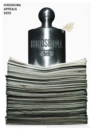
「ヒロシマという重石」
戦後生まれの「ヒロシマ・アピールズ」ポスター制作者は、私で4人目です。どのようなビジュアルにするべきか、想像以上に悩みました。そして覚悟を決めて選択したビジュアルが、この書類の上に大きな分銅が載っているというものです。
分銅は、もともと天秤に掛けるための物。広島はかつて、天秤に掛けられ、原爆を落とされました。落とす側には理屈があります。この広島という分銅が、このビジュアルでは書類の上に載る大きな重石になっています。書類はあらゆる「理屈」を象徴していて、分銅が理屈の重石になっている。どんな理屈があろうが、やってはいけないことがある、ということを表現したつもりです。
そして、分銅の肩に一匹の蝶がとまっています。これは、第1回の亀倉雄策さんのポスターに表現されている傷ついた蝶の生まれ変わりとして表現しました。
Title: “The Weight of Hiroshima”
I’m the fourth designer of a “Hiroshima Appeals” poster to have been born in the postwar era, and I struggled even more than I imagined in deciding what kind of visual I should aim for. What I ultimately decided on was a large balance weight, of the kind normally placed on a balance scale, sitting atop a pile of documents. Seventy years ago Hiroshima’s fate hung in the balance ? and an atom bomb was dropped on it. The party that drops a bomb has an argument to justify its actions. In my graphic, the balancing weight named Hiroshima is a heavy one, and it presses the documents down greatly. The documents represent every kind of “argument” imaginable, and the weight of Hiroshima presses down on them. My intention was to express that there are some things that, no matter what argument might be put forward, one must never do. A lone butterfly is seen perched on the weight. I intended it as a reincarnation of the burning butterflies depicted in the very first “Hiroshima Appeals” poster, by Yusaku Kamekura.
I’m the fourth designer of a “Hiroshima Appeals” poster to have been born in the postwar era, and I struggled even more than I imagined in deciding what kind of visual I should aim for. What I ultimately decided on was a large balance weight, of the kind normally placed on a balance scale, sitting atop a pile of documents. Seventy years ago Hiroshima’s fate hung in the balance ? and an atom bomb was dropped on it. The party that drops a bomb has an argument to justify its actions. In my graphic, the balancing weight named Hiroshima is a heavy one, and it presses the documents down greatly. The documents represent every kind of “argument” imaginable, and the weight of Hiroshima presses down on them. My intention was to express that there are some things that, no matter what argument might be put forward, one must never do. A lone butterfly is seen perched on the weight. I intended it as a reincarnation of the burning butterflies depicted in the very first “Hiroshima Appeals” poster, by Yusaku Kamekura.
佐藤 卓
Taku Satoh
佐藤 卓 さとう たく
1979年東京藝術大学デザイン科卒業、1981年同大学院修了、株式会社電通を経て、1984年佐藤卓デザイン事務所設立。「ニッカ・
ピュアモルト」の商品開発から始まり、「明治おいしい牛乳」「ロッテ キシリトールガム」「S&Bスパイス&ハーブ」などの商品デザイン、「金沢21世紀美術館」「国立科学博物館」のシンボルマーク、「PLEATS PLEASE ISSEY MIYAKE」のグラフィックデザイン、「武蔵野美術大学美術館・図書館」のロゴ、サイン及びファニチャーデザインを手掛ける。NHK Eテレ「にほんごであそぼ」アートディレクター・「デザインあ」総合指導、21_21 DESIGN SIGHT ディレクターを務めるなど、多岐に渡って活動。また、大量生産品をデザインの視点で解剖する「デザインの解剖」プロジェクトが話題を呼ぶ。代表著書に『クジラは潮を吹いていた』( DNPアートコミュニケーションズ)、『JOMONESE』(美術出版社)、写真集『真穴みかん』(平凡社)。
Profile
After initially working for Dentsu, Inc., Mr. Satoh established Taku Satoh Design Office Inc. in 1984. His scope of artistic activities is remarkably broad. He created such well-known package designs as those for Lotte’s “Xylitol” chewing gum series and Meiji’s “Oishii Gyunyu” milk. He conceived the logomarks for the 21st Century Museum of Contemporary Art in Kanazawa and the National Museum of Nature and Science in Tokyo. And he has served as art director for the “Nihongo de Asobo” children’s program on NHK’s educational channel, overall supervisor of the “Design Ah!” children’s program on the same channel, and one of three directors of 21_21 DESIGN SIGHT gallery. His publications include “Kujira wa shio o fuite ita” (DNP Art Communications), “JOMONESE” (Bijutsu Shuppan-sha) and the photo book “Maana ? Mikan” (Heibonsha). Mr. Satoh is a member of AGI, JAGDA, Tokyo ADC, Tokyo TDC and Japan Design Committee.
After initially working for Dentsu, Inc., Mr. Satoh established Taku Satoh Design Office Inc. in 1984. His scope of artistic activities is remarkably broad. He created such well-known package designs as those for Lotte’s “Xylitol” chewing gum series and Meiji’s “Oishii Gyunyu” milk. He conceived the logomarks for the 21st Century Museum of Contemporary Art in Kanazawa and the National Museum of Nature and Science in Tokyo. And he has served as art director for the “Nihongo de Asobo” children’s program on NHK’s educational channel, overall supervisor of the “Design Ah!” children’s program on the same channel, and one of three directors of 21_21 DESIGN SIGHT gallery. His publications include “Kujira wa shio o fuite ita” (DNP Art Communications), “JOMONESE” (Bijutsu Shuppan-sha) and the photo book “Maana ? Mikan” (Heibonsha). Mr. Satoh is a member of AGI, JAGDA, Tokyo ADC, Tokyo TDC and Japan Design Committee.
ヒロシマ・アピールズ2015ポスター購入はこちらから ▶
2014 DESIGNER 井上 嗣也

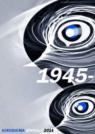
「記憶」
数十年前、『廣島』と題名された原爆被害の写真集を見た。そこにある笑顔の子供たちの写真に付けられた説明文「これからは小鳥のように楽しく生きたいと、原爆の子たちはいっている。しかしその小鳥はとても自分のピカドン傷を気にしている。」という言葉が、強い印象で残っている。
戦後に生まれた私たちは、その悲惨な出来事の断片化した知識を、時間と共に遠ざかる記憶として持っている。しかし記録された写真や映像や活字などで被爆の事実を知るほどに、一瞬にして生活と命を奪った行為に対して悲しみ、改めて核への恐怖を覚える。忘れることで今を享受することが出来るかも知れないが、忘れることの危うさもある。1945年の出来事を忘れないで、長く困難な道かも知れないが、「核の傘」という抑止力に頼らない社会の実現を望むばかりだ。
デザイン作業中は、人工の破壊力によって命を奪われた人々の思いと、「生命は生存したいと願う」という自身の気持を確認しながら臨んだ。画面の生物は、晴天のもと新良太氏に撮影していただいた太陽の光と影の写真によって、時間と記憶を意図して定着に向った。
この親子二世代の生物は、風化される記憶の忘却を憂い、反核の強い決意で、忘れてはならない「1945年の記憶」を次の世代に伝えていって欲しいと願っている。
井上 嗣也
井上 嗣也 いのうえ つぐや
1947年生まれ。1978年ビーンズ設立。アートディレクター、グラフィックデザイナー。
広告、音楽、出版、TVなどのアートディレクションの仕事。 写真とタイポグラフィの斬新なデザインワークでジャンルを横断した仕事を続けている。
日本プロ野球機構シンボルマーク「NPB」制作。
東京ADCグランプリ、東京TDCグランプリ受賞。日本宣伝賞山名賞。
井上嗣也作品集『INOUE TSUGUYA GRAPHIC WORKS 1981-2007』、『INOUE TSUGUYA GRAPHICS TALKING THE DRAGON』(リトルモア刊)。
東京ADC会員、東京TDC会員、JAGDA会員。
ヒロシマ・アピールズ2014ポスター購入はこちらから ▶
2013 DESIGNER 葛西 薫
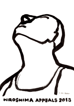
「夏の陽のまぶしさ」
夏の陽のまぶしさは悲しみをともない、白い紙を前に筆を持ったらしぜんにこの絵になった。なん枚も描いているうちにさまざまな思いが押し寄せて、そしてこれ以上描けなくなった。
人は誰かに支えられ、誰かを思っている。人はそれがあるから生きていける。原爆は、一人の心に刻まれた、たいせつな人への思慕、恩愛までも奪うことは決してできない。
このポスターが、犠牲となった方、残された方のそれぞれの思いに寄り添うことができればと、心から願います。
葛西薫
Title: Natsu no Hi no Mabushisa
(Glare of the Sun in Summer)
The glare of the sun in summer is accompanied by sadness. I picked up a brush in front of a white paper and drew this picture without thinking. Various feelings came to me while I repeated drawing, and then I could not keep drawing any longer. We are supported by somebody, and we think of somebody. That’s why we can live. An atomic bombing can by no means take our heart away from the yearning or affection for the people that we love. I deeply hope that this poster can accompany what victims and survivors feel.
Kaoru Kasai
葛西 薫 かさい かおる
1949年北海道札幌市生まれ。1968年文華印刷、1970年大谷デザイン研究所を経て、1973年サン・アド入社、現在に至る。
代表作にサントリーウーロン茶(1983年~)、ユナイテッドアローズ(1997年~)などの長期にわたる広告制作、虎屋のCI・空間計画、パッケージデザイン(2004年~)などのほか、サントリー、サントリー美術館、六本木商店街振興組合のCI・サイン計画、映画・演劇の宣伝制作、写真集の装丁など活動は多岐。
近作に、「建築を考える」(ペーター・ツムトア著/みすず書房)、「IRON STILLS―アメリカ、鉄の遺構」(半田也寸志 写真・文/ADP)の装丁、スポーツカーTOYOTA86の広告、TORAYA TOKYOの店舗計画、NHKみんなのうた「泣き虫ピエロ」の動画がある。
東京ADCグランプリ、毎日デザイン賞、朝日広告賞、講談社出版文化賞ブックデザイン賞、日本宣伝賞山名文夫賞など受賞。
展覧会=1984年「葛西薫とSONY」(デザインギャラリー1953・銀座松屋)、 1992年「‘AERO’葛西薫展」(ギンザ・グラフィック・ギャラリー)、 2007年「葛西薫1968」(クリエイションギャラリーG8、ガーディアン・ガーデン)など。
著書=「葛西薫の仕事と周辺」(六耀社)、「世界のグラフィックデザイン35 葛西薫」(DNPアートコミュニケーションズ)、「図録 葛西薫1968」(ADP)
東京ADC、東京TDC、JAGDA、AGI会員
ヒロシマ・アピールズ2013ポスター購入はこちらから ▶
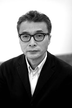
2012 DESIGNER 奥村 靫正
奥村 靫正 おくむら ゆきまさ
1947年12月4日 愛知県生まれ(2012年5月31日現在64歳)東京都品川区在住
1947年愛知県に生まれる。1968年桑沢デザイン研究所卒業。1970年WORKSHOP MU!! の創立に参加、日本のロックミュージックの数々のアルバムデザインに携わる(はっぴいえんど・キャロル・サディスティックミカバンド・大滝詠一 等)。1979年ザ・ステューディオ・トウキョウ・ジャパン設立、この頃よりYellow Magic Orchestraのアートディレクターとして、アルバム、ポスター、映像、ステージ、コマーシャルなどのディレクションを手がけ注目される。また山下達郎、佐野元春、ムーンライダース、加藤和彦、チェッカーズ等のアルバムアートディレクションをおこなう。Y.M.Oを中心としたアートディレクションにより82年からADC賞を4回受賞。その他書籍に於いて、林真理子、村上龍、中沢新一等のブックデザイン。1985年より日本画の様式をとり入れたグラフィック作品を制作。1989年PCによるグラフィック作品の制作を日本で初めておこなう。1990年宮内庁より大嘗祭のための画家に選定され絵画をおさめる。1997年日本パリ文化会館「デザインの世紀展」ポスターを制作。近年では、2009年に福岡伸一「動的平衡」、2011年篠山紀信写真集 ATOKATA」のブックデザインをおこなう。他にも広告、ポスター、ブックデザインやステージデザイン、舞台美術等、多くのジャンルを手がける。著書として、gggBooks、アイデア(特集:THE STUDIO TOKYO JAPAN)、WORKSHOP MU!! 作品集などがある。女子美術大学芸術学部デザイン学科教授。東京ADC会員、JAGDA会員、東京TDC会員。
株式会社TSTJ
東京都品川区西五反田1-32-8 ぐれいぷハウス2F TEL 03-5434-8031
| 1947年 | 愛知県生まれ | |
| 1968年 | 桑沢デザイン研究所卒 | |
| 1970年 | WORKSHOP MU!! の創立に参加 | |
| 1977年 | ザ・ステューディオ・トウキョウ・ジャパン(TSTJ)設立 | |
| 1982年 | 東京ADC賞/YMO コンサート ツアー「ウィンター・ライヴ1981」[ステージデザイン] | |
| 1984年 | 東京ADC賞/YMO写真集「SEALED」[エディトリアルデザイン][雑誌広告] | |
| 1985年 | 東京ADC賞/細野晴臣「S-F-X」[ポスター] | |
| 1986年 | 東京ADC賞/村上龍「POST・ポップアートのある部屋」[ブックデザイン] | |
| 1994年 | 桑沢学園第2回/桑沢賞 | |
| 2003年 | グッドデザイン賞 金賞[ブルーミング中西「CSL」] | |
| 2007年 | ニューヨーク「The One Show」 デザイン部門金賞[女子美アートミュージアム「KIMONO」ポスター] | |
| 桑沢学園第15回デザイン・オブ・ザ・イヤー賞[WORKSHOP MU!!] その他多くの受賞 |
ヒロシマ・アピールズ2012ポスター購入はこちらから ▶
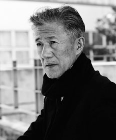
2011 DESIGNER 遠藤 享
遠藤 享 えんどう すすむ
1933年12月23日 山梨県甲府市生まれ 東京都渋谷区在住 1933年山梨県甲府市生まれ。1959年武蔵野美術学校(現大学)デザイン科中退。1962年桑沢デザイン研究所グラフィックデザイン研究科卒。版画や、近年ではコンピュータでイメージ表現した静けさのある独特の作品で著名である。その作品はドイツ、ユーゴ、ブルガリア、フィンランド等の世界各国で賞を受けており、大英博物館、サンパウロ美術館をはじめ、多数の美術館にコレクションされている。
1999年紫綬褒章受章。東京ADC会員、JAGDA会員。
遠藤享デザイン室 東京都渋谷区神宮前3-13-3 TEL 03-3478-1577
| 1933年 | 山梨県甲府市生まれ | |
| 1955年 | 武蔵野美術学校(現武蔵野美術大学)中退 | |
| 1962年 | 桑沢デザイン研究所研究科卒 | |
| 1980年 | 第3回世界版画展サンフランシスコ近代美術館特別買上賞 第14回リュブリアナ国際版画ビエンナーレ美術館買上賞 |
|
| 1983年 | 日本版画大賞展優秀賞 | |
| 1985/86年 | 国際美術展京都国立近代美術館賞、第6回ラハティ・ポスタービエンナーレ・オリジナル部門1位 | |
| 1987年 | 講談社出版文化賞ブックデザイン賞 | |
| 1988年 | ドイツ国際カレンダー展最高賞及び金賞 | |
| 1990年 | 文化庁買上優秀美術作品選出及び同展、NOVAM誌・国際カレンダー展グランプリ/ドイツ | |
| 1991年 | インドBHAVAN国際版画ビエンナーレ・グランプリ | |
| 1992年 | INTERPRINT LVIV国際版画展グランプリ/旧ソ連、イビザグラフィック第3位/スペイン | |
| 1992/94年 | SDA賞最優秀賞(通産大臣賞) | |
| 1993年 | ユーモアと風刺ビエンナーレGABROVOグラフィック部門第1位/ブルガリア | |
| 1994年 | クラコウ国際版画トリエンナーレ特別賞 | |
| 1995年 | ノルウェー国際版画トリエンナーレ特別賞 | |
| 1999年 | 紫綬褒章受章 | |
| 2009年 | 金の月桂樹褒章受章(ブルガリア外務省)、東京ADC殿堂入り | |
| 2010年 | 桑沢特別賞受賞 |
◎ 個展
サンパウロ美術館・山梨県立美術館他、ロンドン・フランクフルト・ヘルシンキ・ソフィア・ソウル・台北・東京等
◎ パーマネント・コレクション
海外/大英博物館・サンパウロ美術館・ワルシャワ及びクラコウ各国立美術館他、アメリカ・スペイン・ポーランド・ブルガリア・クロアチア・スロベニア・インド・オーストラリア・ウクライナ・イスラエル等各国公立美術館。
日本/文化庁、国立京都近代美術館等、国公立美術館9箇所。
海外/大英博物館・サンパウロ美術館・ワルシャワ及びクラコウ各国立美術館他、アメリカ・スペイン・ポーランド・ブルガリア・クロアチア・スロベニア・インド・オーストラリア・ウクライナ・イスラエル等各国公立美術館。
日本/文化庁、国立京都近代美術館等、国公立美術館9箇所。
主な作品
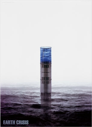
DROP OF WATER 1984
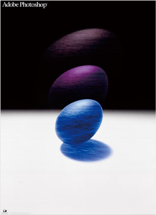
Adobe Photoshop 1991
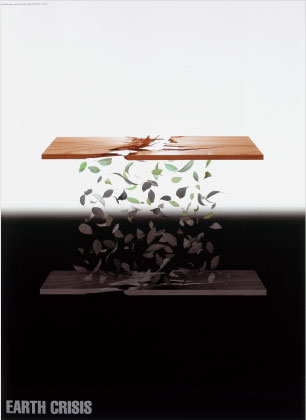
EARTH CRISIS WOOD 1992
EARTH CRISIS WATER 1992
遠藤享 版画展 1992
LIFE 1994-A 1994
国際学生照明デザインコンペ14th 2000
国際学生照明デザインコンペ17th 2003
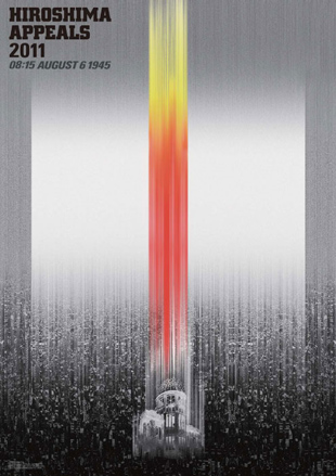
『負の閃光』
2011年3月11日 福島原発事故発生!その数日後、「『ヒロシマ・アピールズ』ポスター制作を」との連絡を受ける。僕はさっそく広島行きを決行、心の準備を始める。何か通常とは違う緊張感を持って、僕にとって三度目になるが、原爆ドームの前に立った。
瞬間的に福島第一原発の建屋崩壊状態の風景とダブってしまう中、カメラのシャッターを切った。基本的なデザインの方向性は、その時ほぼ決定づけられたと言える。
今まさに様々に論じられている、日本の核への危機感が自分をそうさせたのだと思う。表現手段として原爆ドームを素材として使用するというのは、実に安易な発想であり、陳腐なものになる可能性は大きい。が、僕はあえて難課題を自分に課す事を選んだ。
僕が試行錯誤しながら、『ヒロシマ・アピールズ』を制作しているのを見た6年生の孫が『あっ!これ原爆ドームだね!』と大声で叫んだ。さて、僕の表現から何が伝えられるだろうと考えつつ制作をした。
2011.5.30 遠藤 享
ヒロシマ・アピールズ2011ポスター購入はこちらから ▶